


Typography Tricks for Crafting Posters
go.ncsu.edu/readext?998950
en Español / em Português
El inglés es el idioma de control de esta página. En la medida en que haya algún conflicto entre la traducción al inglés y la traducción, el inglés prevalece.
Al hacer clic en el enlace de traducción se activa un servicio de traducción gratuito para convertir la página al español. Al igual que con cualquier traducción por Internet, la conversión no es sensible al contexto y puede que no traduzca el texto en su significado original. NC State Extension no garantiza la exactitud del texto traducido. Por favor, tenga en cuenta que algunas aplicaciones y/o servicios pueden no funcionar como se espera cuando se traducen.
Português
Inglês é o idioma de controle desta página. Na medida que haja algum conflito entre o texto original em Inglês e a tradução, o Inglês prevalece.
Ao clicar no link de tradução, um serviço gratuito de tradução será ativado para converter a página para o Português. Como em qualquer tradução pela internet, a conversão não é sensivel ao contexto e pode não ocorrer a tradução para o significado orginal. O serviço de Extensão da Carolina do Norte (NC State Extension) não garante a exatidão do texto traduzido. Por favor, observe que algumas funções ou serviços podem não funcionar como esperado após a tradução.
English
English is the controlling language of this page. To the extent there is any conflict between the English text and the translation, English controls.
Clicking on the translation link activates a free translation service to convert the page to Spanish. As with any Internet translation, the conversion is not context-sensitive and may not translate the text to its original meaning. NC State Extension does not guarantee the accuracy of the translated text. Please note that some applications and/or services may not function as expected when translated.
Collapse ▲Ever feel like your readers are wandering through a maze when they dive into your articles? Spice things up with a splash of styles and a dash of shades. Establishing a clear hierarchy of information using some visual cues can transform your text from puzzling to crystal clear, allowing readers to grasp the idea of the content with ease.
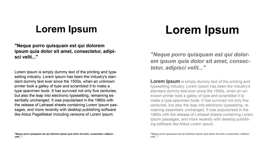
Poster Comparison
Take these two posters for example, employing bold and larger font sizes for headings (right) effectively highlights critical information, capturing the viewer’s attention immediately. Conversely, opting for lighter or smaller font sizes for secondary elements like footnotes fosters a smooth, cohesive flow throughout the document. This strategic use of typographic variations not only enhances readability, but also guides the user’s eye across the page in a logical, orderly fashion. This approach ensures that essential details stand out while maintaining an overall unity in the design, making the content both appealing and easy to navigate.