
Pure Black Background Alternatives for Poster Design
go.ncsu.edu/readext?982304
en Español / em Português
El inglés es el idioma de control de esta página. En la medida en que haya algún conflicto entre la traducción al inglés y la traducción, el inglés prevalece.
Al hacer clic en el enlace de traducción se activa un servicio de traducción gratuito para convertir la página al español. Al igual que con cualquier traducción por Internet, la conversión no es sensible al contexto y puede que no traduzca el texto en su significado original. NC State Extension no garantiza la exactitud del texto traducido. Por favor, tenga en cuenta que algunas aplicaciones y/o servicios pueden no funcionar como se espera cuando se traducen.
Português
Inglês é o idioma de controle desta página. Na medida que haja algum conflito entre o texto original em Inglês e a tradução, o Inglês prevalece.
Ao clicar no link de tradução, um serviço gratuito de tradução será ativado para converter a página para o Português. Como em qualquer tradução pela internet, a conversão não é sensivel ao contexto e pode não ocorrer a tradução para o significado orginal. O serviço de Extensão da Carolina do Norte (NC State Extension) não garante a exatidão do texto traduzido. Por favor, observe que algumas funções ou serviços podem não funcionar como esperado após a tradução.
English
English is the controlling language of this page. To the extent there is any conflict between the English text and the translation, English controls.
Clicking on the translation link activates a free translation service to convert the page to Spanish. As with any Internet translation, the conversion is not context-sensitive and may not translate the text to its original meaning. NC State Extension does not guarantee the accuracy of the translated text. Please note that some applications and/or services may not function as expected when translated.
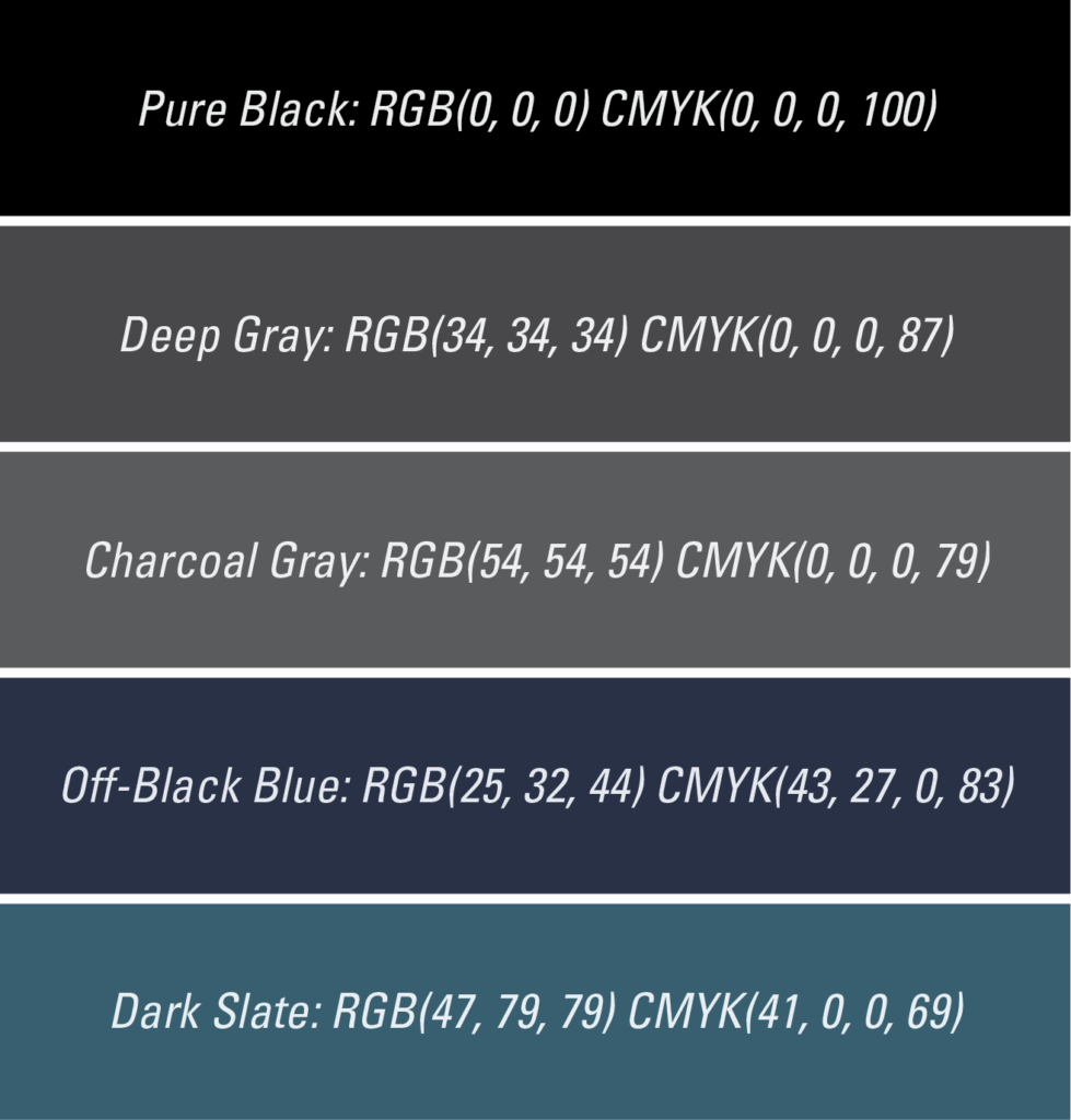
Collapse ▲When designing a poster for your Extension activities, you might be tempted to pick a dark color for its elegant vibe as the background. However, whether you’re starting from scratch or using tools like Canva, think twice before opting for a pure black background.
Why? Super dark black can be overwhelming – it’s like gazing into a starless night sky. Instead, consider using a really dark gray or a deep navy blue – colors that evoke a cozy nighttime scene, not just an empty void. These softer shades are gentler on the eyes and help other elements on your poster stand out effortlessly. They also add a touch of mystery and depth to your design, ensuring your poster catches the eye in a sea of others. So, next time you’re choosing a background, shy away from the deepest black and opt for a softer, deeper color that lends your poster a cool, sophisticated vibe. Here are some alternatives for your reference: