Creating Accessible Content - Text-Heavy Images
(Updated: July 11, 2024, 12:40 p.m.)
Accessibility in digital content is crucial for ensuring that all users, including those with disabilities, can access and benefit from the information. Even more so, it is easier to create accessible content digitally. The steps that you take to create accessible web content also make your content more SEO-friendly, resulting in higher visibility of your content to your current and potential audiences. While there are numerous reasons why you should create accessible content, there’s also the biggest reason, you are required to.
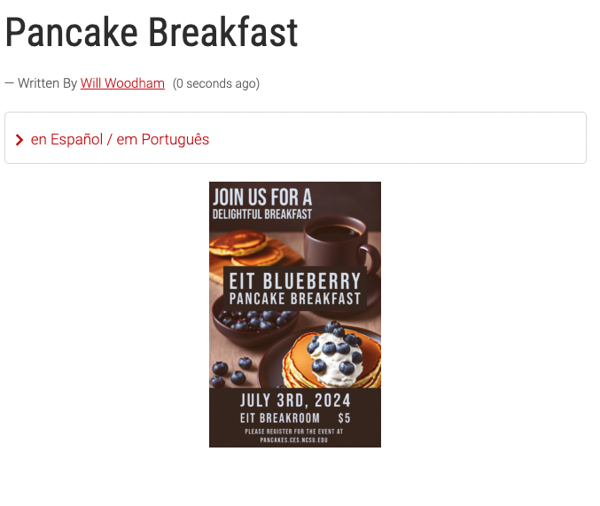
Bad
In this example all of the information included in the image is not accessible to screen readers. You should never post in this manner. Even if the information is available in the images alt-text this post is not SEO friendly.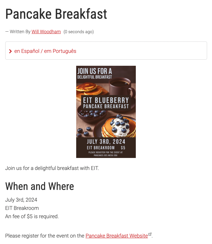
Better
This post is a good bit better. We still have a text-heavy image, but all of the information is included in the body of the post. Users can now click the link to register for the event. This is still not a clean post, and can be improved but it is the minimum that needs to occur when posting text-heavy images.
Best
This post is the best-case scenario. We are using a high-quality hero image that contains no text. All of the relevant information is in the body of the text. It's a clean, professional-looking post.What about newsletters?
We have a number of counties that publish monthly newsletters for their counties. These newsletters have some great content but often are available as images. For these, you have a few options.- Include a link to an accessible PDF version of the newsletter at the top of the page. This is the easiest way to meet the minimum requirements. If you aren’t sure if your PDF is accessible, the quickest way is to try to highlight text in the document. If you can’t highlight the text, chances are it is not available for screen readers to read.
- Include a single “Front Page” article on the newsletter announcement page along with a link to an accessible PDF. This serve as content for your site, drawing people into the newsletter post and increasing engagement while also ensuring your post is accessible and has useful content.
- Make posts for each of your newsletter articles! You can make a post for each article in plain text so that each article is available on your site. You can still include a link to the accessible, more graphical PDF. Make sure to tag all your articles with the same tags so that users can easily find others from that month!
Newsletters are Meant to be Text-heavy
These graphically impressive creations are great, but there is no getting around the fact that they have to include a large amount of text content. So, in addition to making sure that the text is accessible to screen readers, make sure you follow good design rules for your newsletter.Avoid using images as the background to your newsletters. While these can make your creation "pop," they tend to increase the amount of visual noise in the document, which can make it very hard to read for some individuals. You can use muted and low-contrast texture images if you want the document to look printed on paper, but in general, it's best to avoid images and use solid colors instead.
When choosing colors, make sure you are choosing colors for the font that have a high contrast ratio to the background. The higher the ratio the more easily your text will be read. If you want to see if your colors pass the contrast ratio test, use the WebAIM: Contrast Checker.
On that same note, make sure you choose highly legible fonts. For more information on font choice, check out EIT's Choosing Accessible Fonts post.It's Work, but It's Worth It
These steps will increase the time it takes to create new content. However, you are not only fulfilling a requirement; you are also ensuring that anyone who wants to read your content can. It might seem like something small, but it is important.If you have questions or need help with creating accessible content for the web, EIT is here to help!Further Reading
NC State - Accessibility Regulation FAQsNC State Extension - Digital Accessibility
NC State - IT Accessibility Handbook