Ever feel like your readers are wandering through a maze when they dive into your articles? Spice things up with a splash of styles and a dash of shades. Establishing a clear hierarchy of information using some visual cues can transform your text from puzzling to crystal clear, allowing readers to grasp the idea of the content with ease.
Typography Tricks for Crafting Posters
(Updated: April 16, 2024, 9 a.m.)
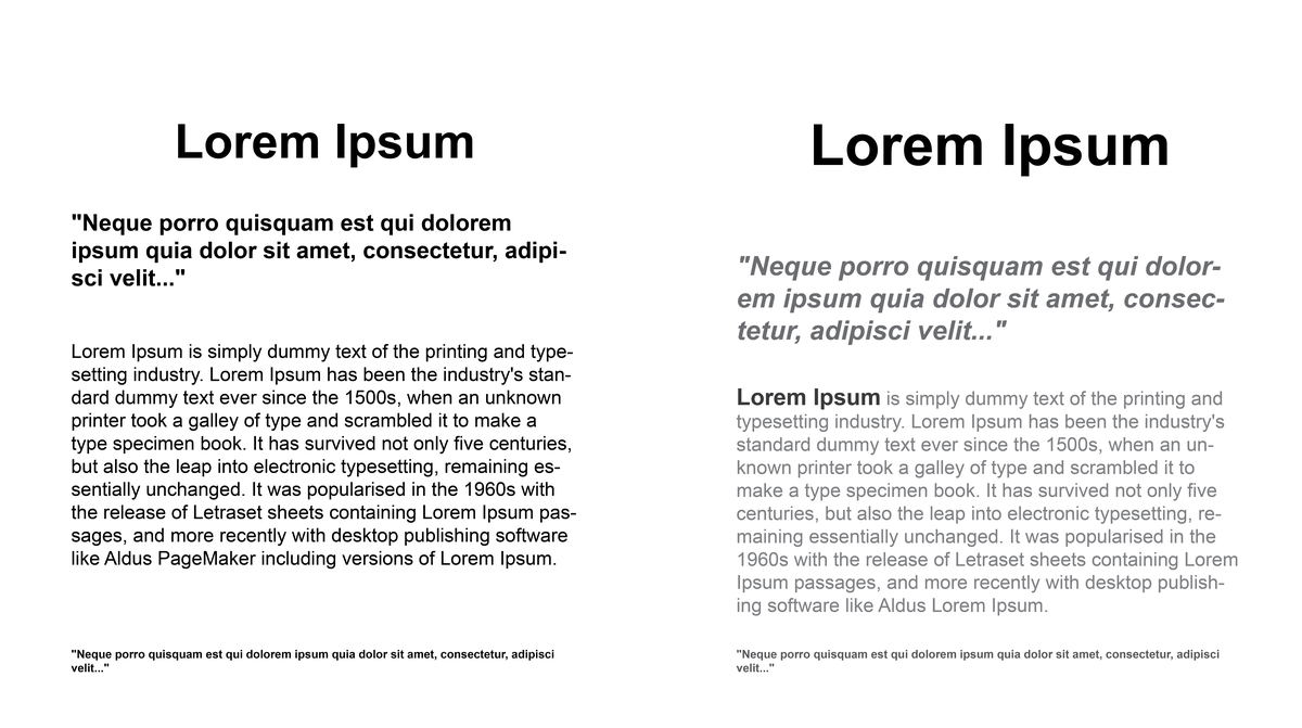
Take these two posters for example, employing bold and larger font sizes for headings (right) effectively highlights critical information, capturing the viewer's attention immediately. Conversely, opting for lighter or smaller font sizes for secondary elements like footnotes fosters a smooth, cohesive flow throughout the document. This strategic use of typographic variations not only enhances readability, but also guides the user’s eye across the page in a logical, orderly fashion. This approach ensures that essential details stand out while maintaining an overall unity in the design, making the content both appealing and easy to navigate.
We also have a few other email lists you can subscribe to.
Written By