Choosing Accessible Fonts
(Updated: May 28, 2024, 5:19 a.m.)
When creating print materials or web content, choosing fonts to maximize clarity and readability is essential. Appropriate font selection can also enhance accessibility for users with low vision or dyslexia.

- Letter Differentiation: Ensure that letters are easy to distinguish from one another. For example, the number "0" should be clearly distinguishable from the capital letter "O," and the lowercase "j" should not closely resemble the lowercase "i".
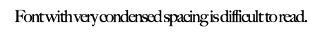
- Spacing: Adequate spacing between letters is essential to avoid visual clutter and improve readability.
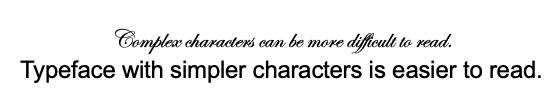
- Simplicity: Avoid unnecessary flourishes that can complicate the appearance of text.
- Size Appropriateness: Use a font size appropriate for the medium. Larger fonts are necessary for TV display slides, as viewers may read slides from several feet away.
- Font Variety: Limit the number of fonts used in a single document. Different fonts should serve specific purposes, such as distinguishing headings from body text or highlighting callout quotes.
- Branding: Follow NC State’s typography guidance to select fonts that are legible and consistent with the NC State brand.
- Standard Fonts: Choose commonly used fonts over unique or custom ones to ensure consistency across different devices and platforms.
- Avoid Overlayed Text on Graphics: Do not use images with embedded text for digital content. Canva files or documents created using "Print to PDF" are not readable by screen readers and can also become blurry or pixelated when resized. Ensure these materials are adapted for the web with real text displayed alongside images.