When designing a poster for your Extension activities, you might be tempted to pick a dark color for its elegant vibe as the background. However, whether you're starting from scratch or using tools like Canva, think twice before opting for a pure black background.
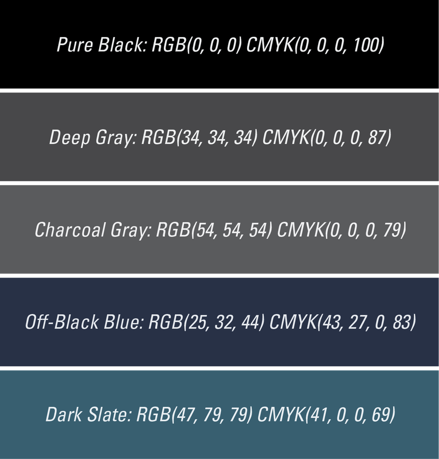
Why? Super dark black can be overwhelming – it's like gazing into a starless night sky. Instead, consider using a really dark gray or a deep navy blue - colors that evoke a cozy nighttime scene, not just an empty void. These softer shades are gentler on the eyes and help other elements on your poster stand out effortlessly. They also add a touch of mystery and depth to your design, ensuring your poster catches the eye in a sea of others. So, next time you're choosing a background, shy away from the deepest black and opt for a softer, deeper color that lends your poster a cool, sophisticated vibe. Here are some alternatives for your reference: